A Fragile Empire
Publication Design | Magazine Spread
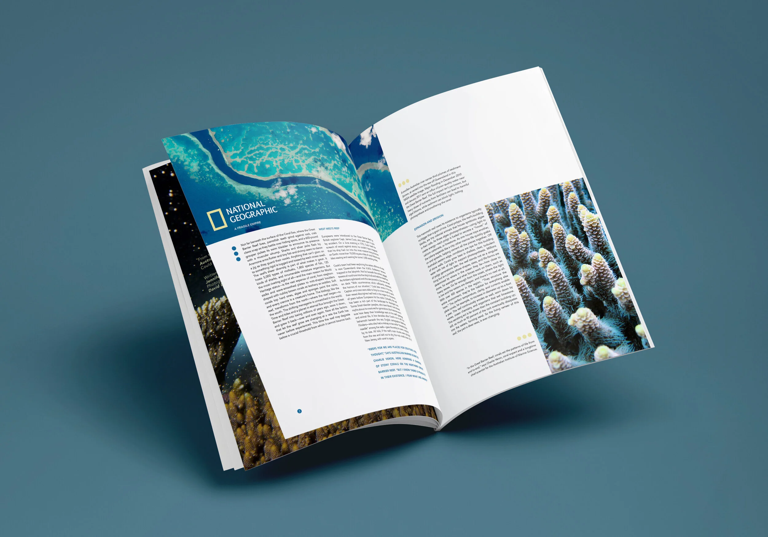
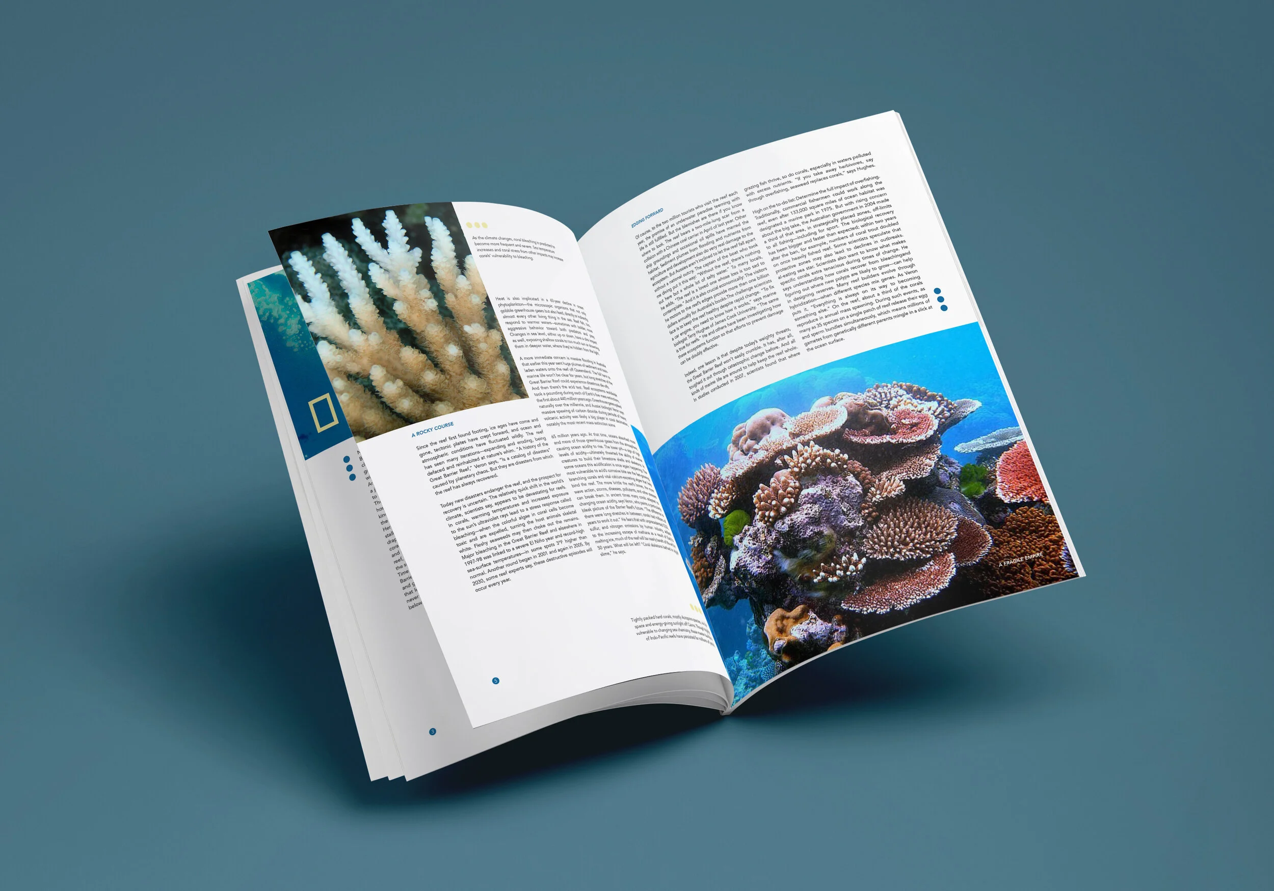
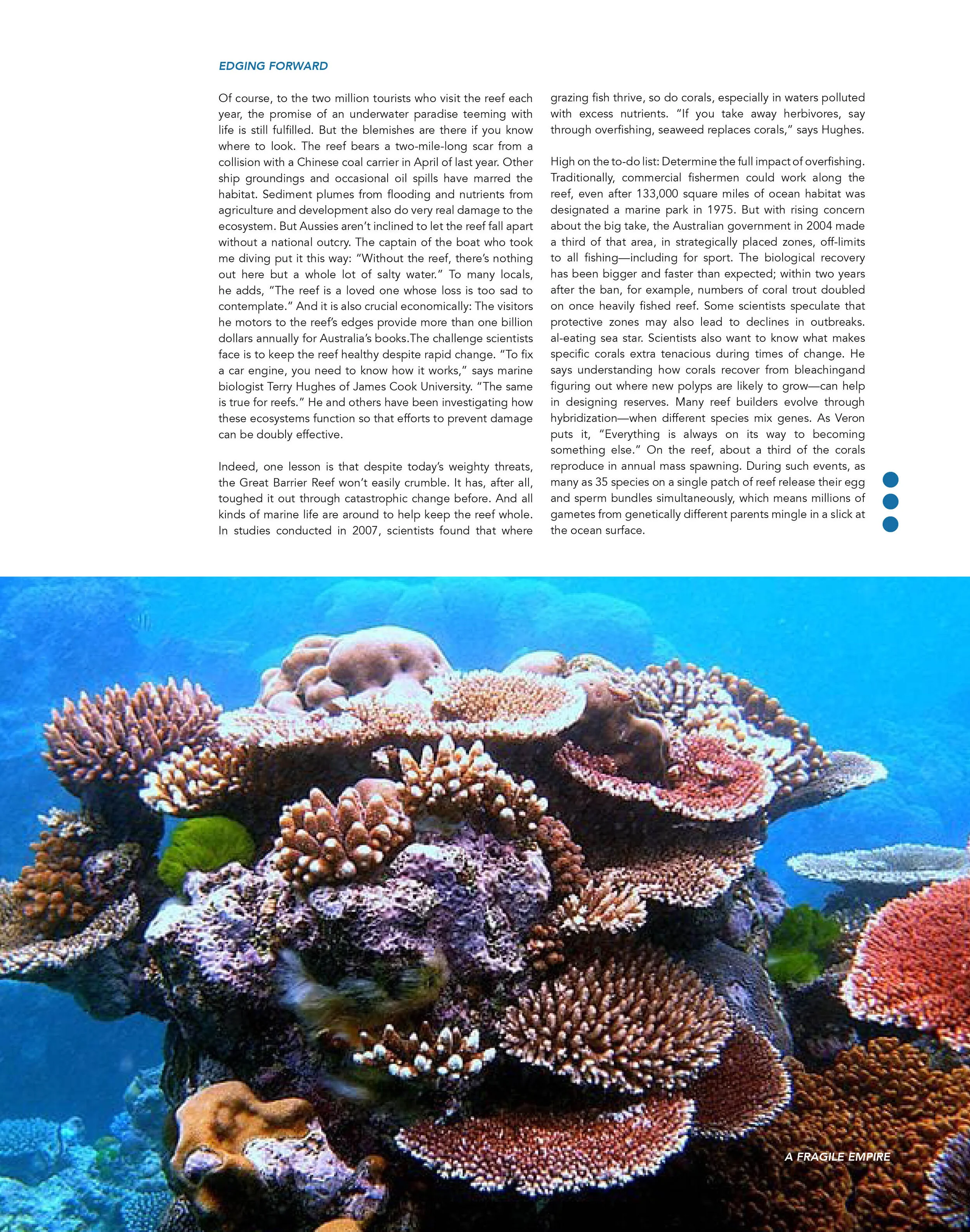
This projects goal was to create a clean and professional layout for a Nation Geographic article. This article talk about the bleaching a destruction of the Great Barrier Reef. The opening spread of the article is designed to make the viewer feel uneasy. A dark mysterious image with bold type reading “a fragile” captures the eye, while the word “empire” is sunk into the background. The type is formed of polyps dissolving into the dark abyss, empires are strong, but this one is falling apart. As the viewer moves to the next page it explodes with a magnificent blue, with justified type your eye is able to focus and move around the images.


